Ville Linnus
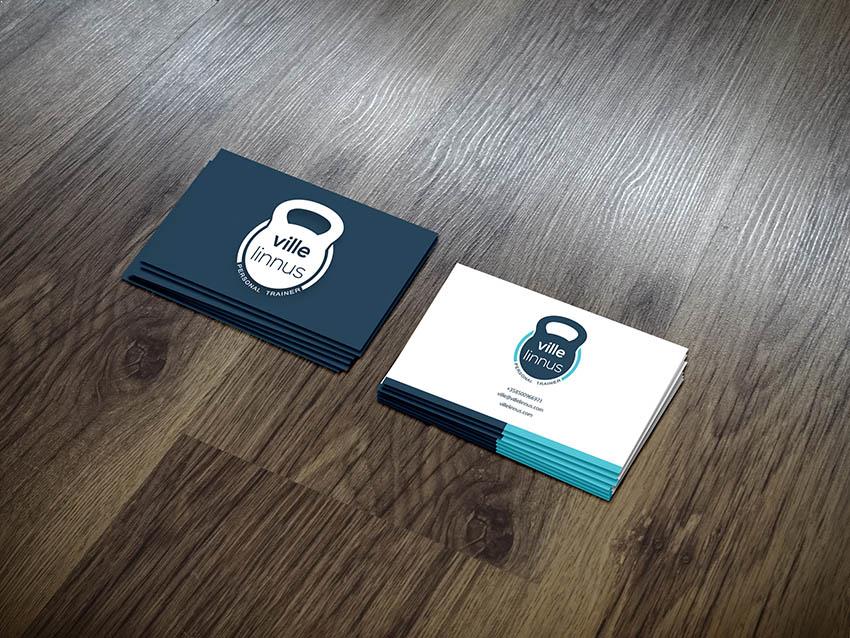
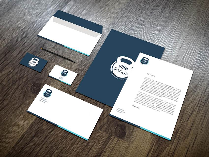
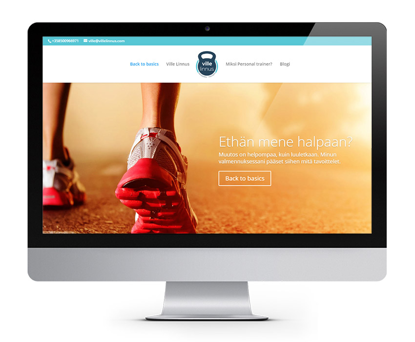
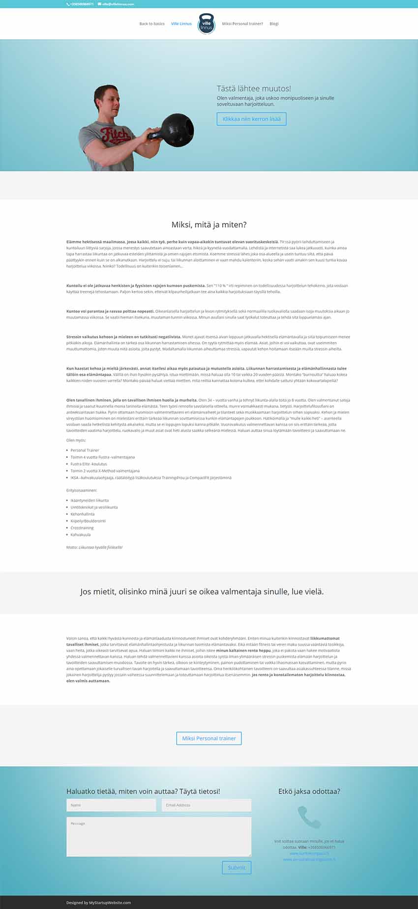
Ville is a Finnish personal trainer based in Helsinki, Finland. He needed a logo and website for his business. He told me that he likes doing kettlebells and suggested using a kettlebell shape in his logo. Personally, I liked the idea because not only the shape is memorable but also represents strength and confidence which are important in his business.
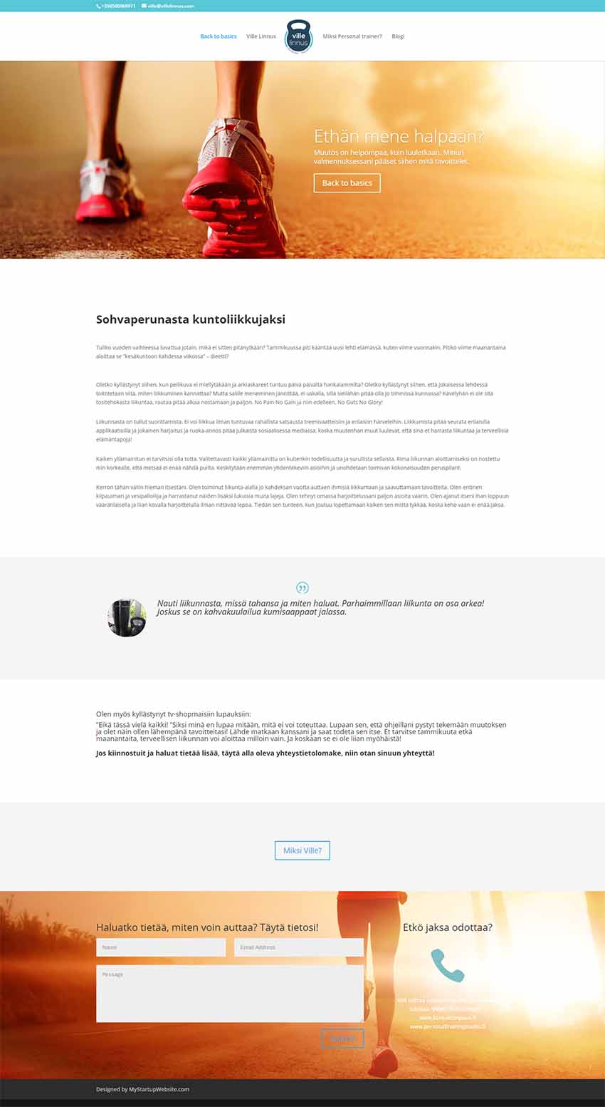
The colors used are light turquoise and blue-green, relaxing colors both mentally and physically because they remind us of nature. They are colors that represent loyalty and trustworthiness. It is important that the customers feel at ease and not stressed when seeing the logo or entering the website. But since overusing these colors might make one cold and slow in action, more warm colors are used on the homepage to get them the excitement to get down to business.
The circle around the kettlebell is to present the kettlebell as more balanced and stable. The light color is used as a contrast to the heavy dark color.
Role: Art director, Graphic designer, Web designer
Adjectives/keywords: Power, strength, confidence, balance, simple
Program: Adobe Illustrator, Adobe Photoshop, WordPress
Branding


Website design
Full credits
Client: Ville Linnus
Art director, Graphic and Web designer: Kania Khalili