

Susanna Toivanen
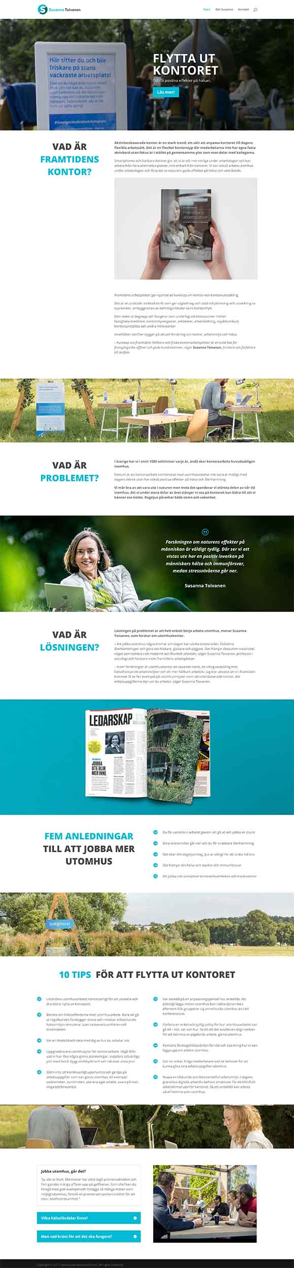
Susanna Toivanen is a professor of sociology in conducting research in the work environment and health. Right now she is investigating what challenges future workplaces face in relation to digitalization and how this can affect the way we work.
She believes if people would be sitting in small indoor offices all day long, they eventually won’t feel good, they won’t be as productive and relaxed. Because they don’t have the balance. Being in nature part of the day gives harmony to their working life.
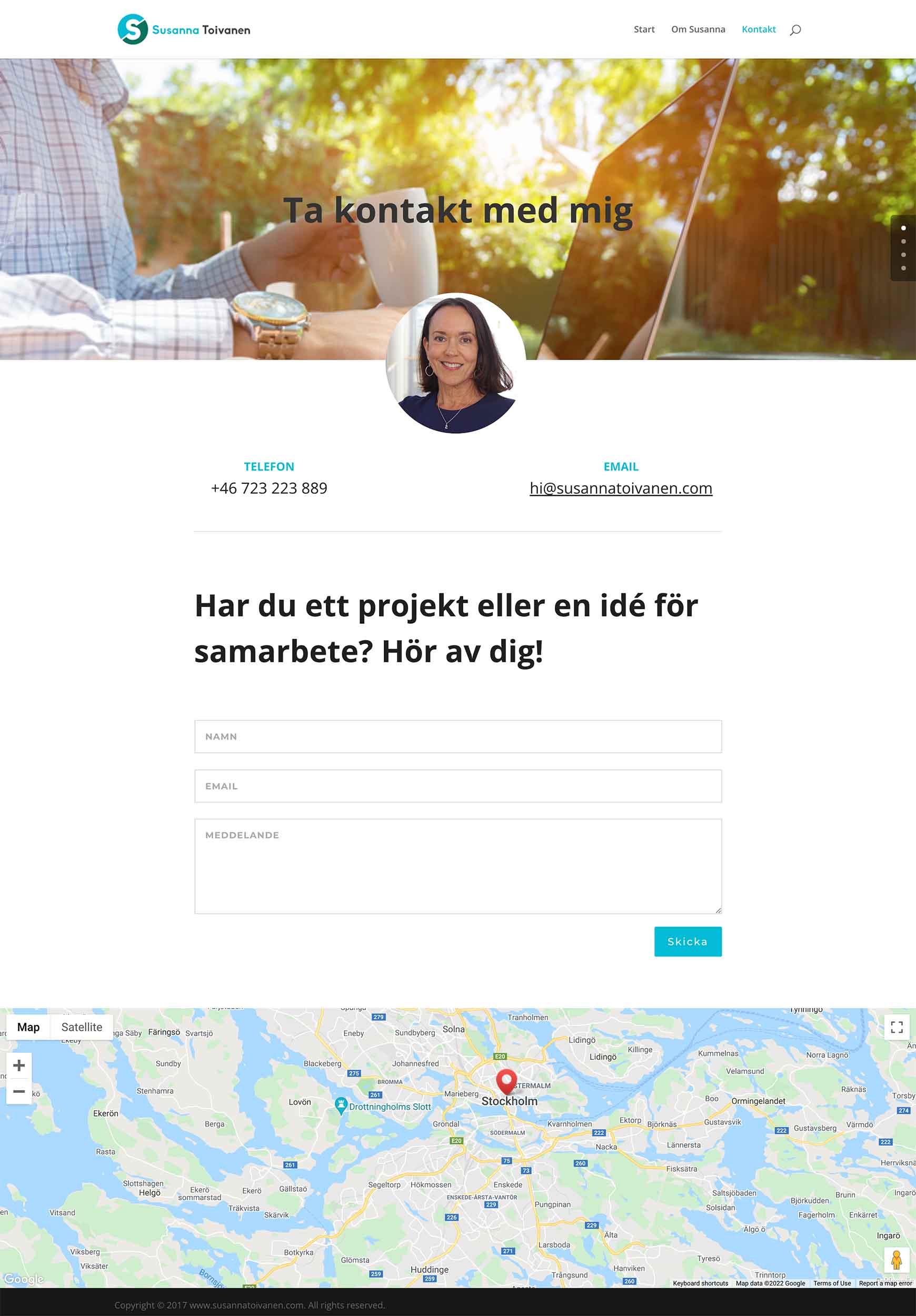
To be able to create awareness she needed our help to create a website and a logo design for her. Later I created some mockups for her website to make it look more professional and presentable.
The colors chosen for the logo are light blue and dark green. Since these colors are associated with nature, like the color of the sky and trees, they represent balance, harmony, relaxation and health. And that’s why they have a very calming effect on us. The blue color associate also with trust and communication. One reason you might have seen many banks using this color. Since their business depends on people’s trust.
When it comes to the symbol, I played around with Susanna’s initial (S). It is always easier for people to remember simplistic forms. I tried to give the symbol a yin-yang effect, with (S) in the middle making the balance between two parts.
Role: Art director, Graphic designer, Web designer
Adjectives/keywords: Approachable, professional, balance, harmony, relaxation, health
Program: Adobe Illustrator, Adobe Photoshop, WordPress
Branding


Website design


Full credits
Client: Susanna Toivanen
Art director, Graphic designer, Web designer: Kania Khalili