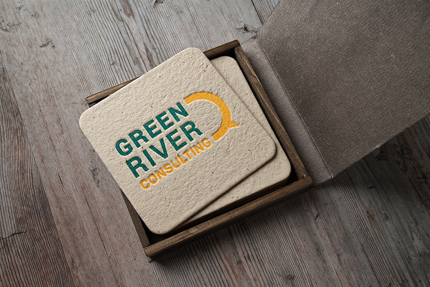
Green River Consulting
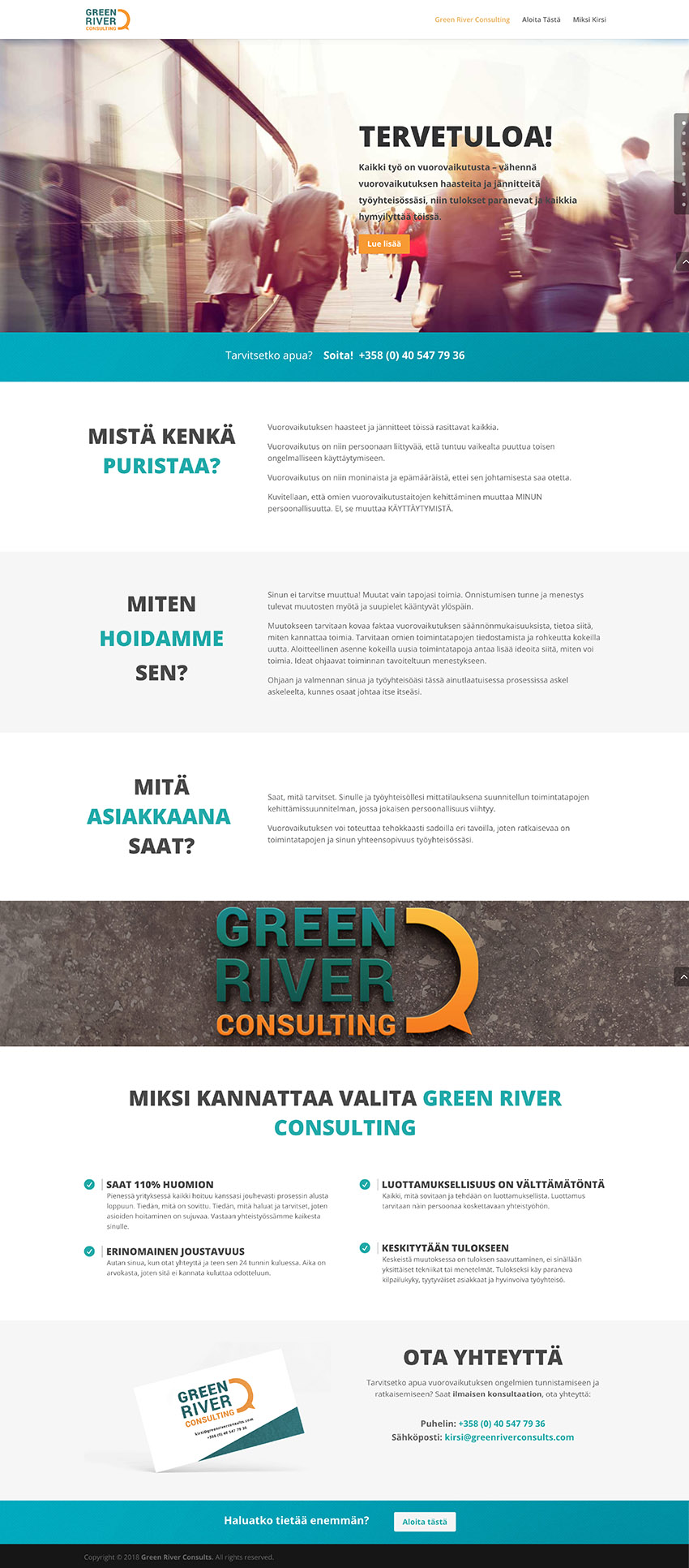
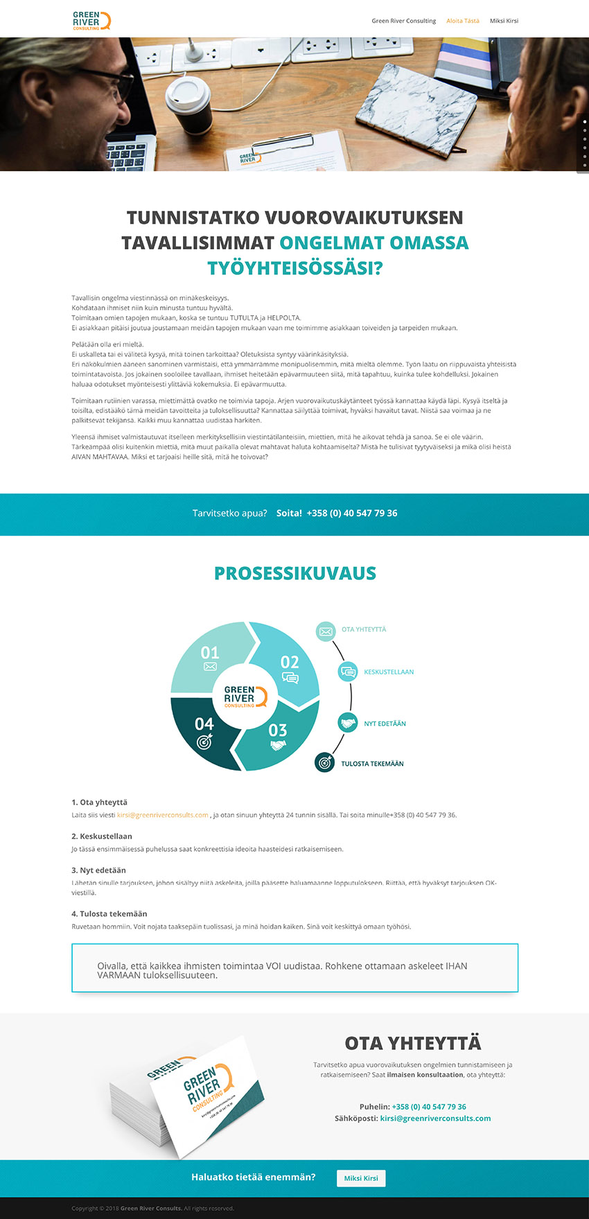
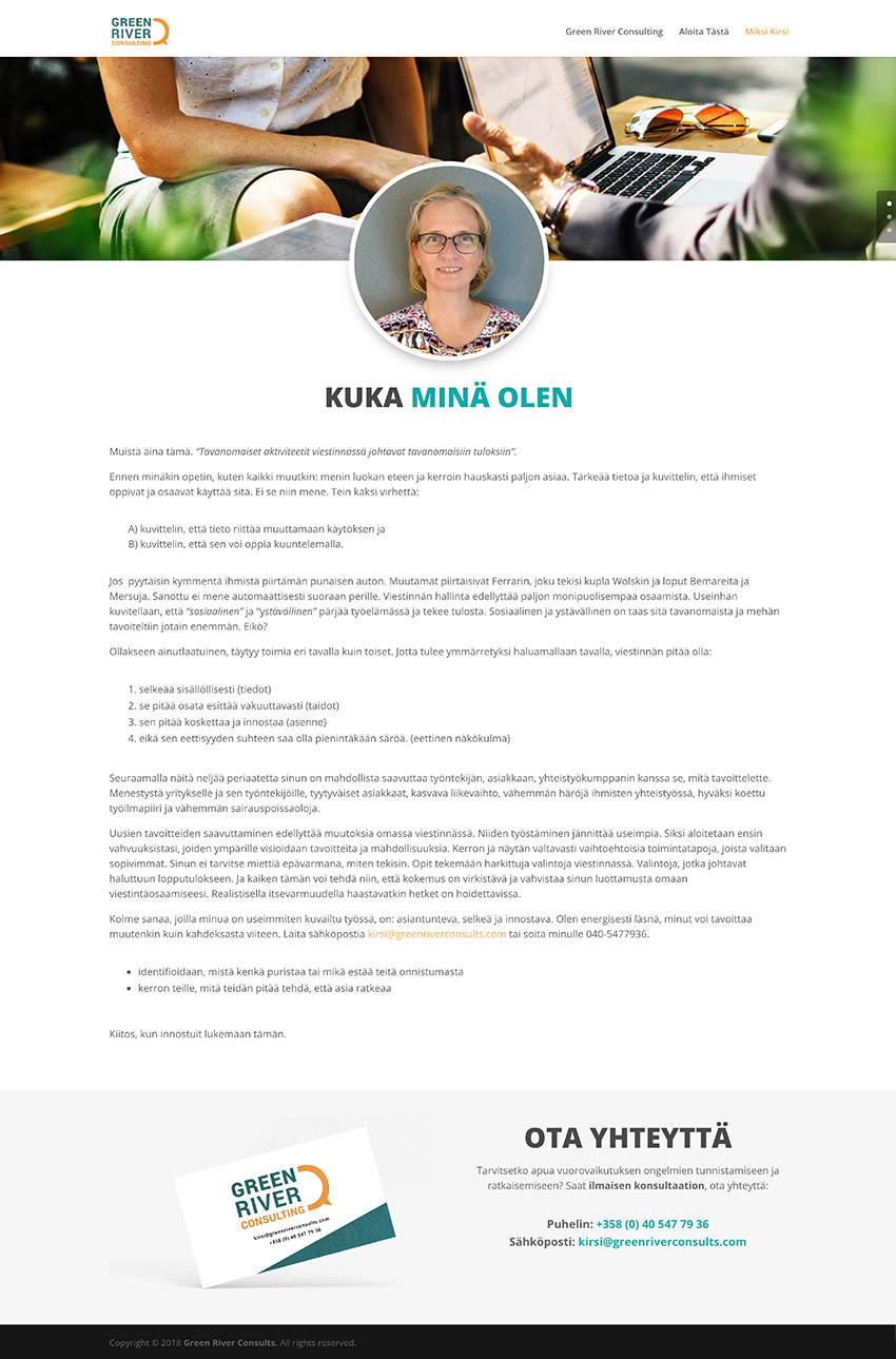
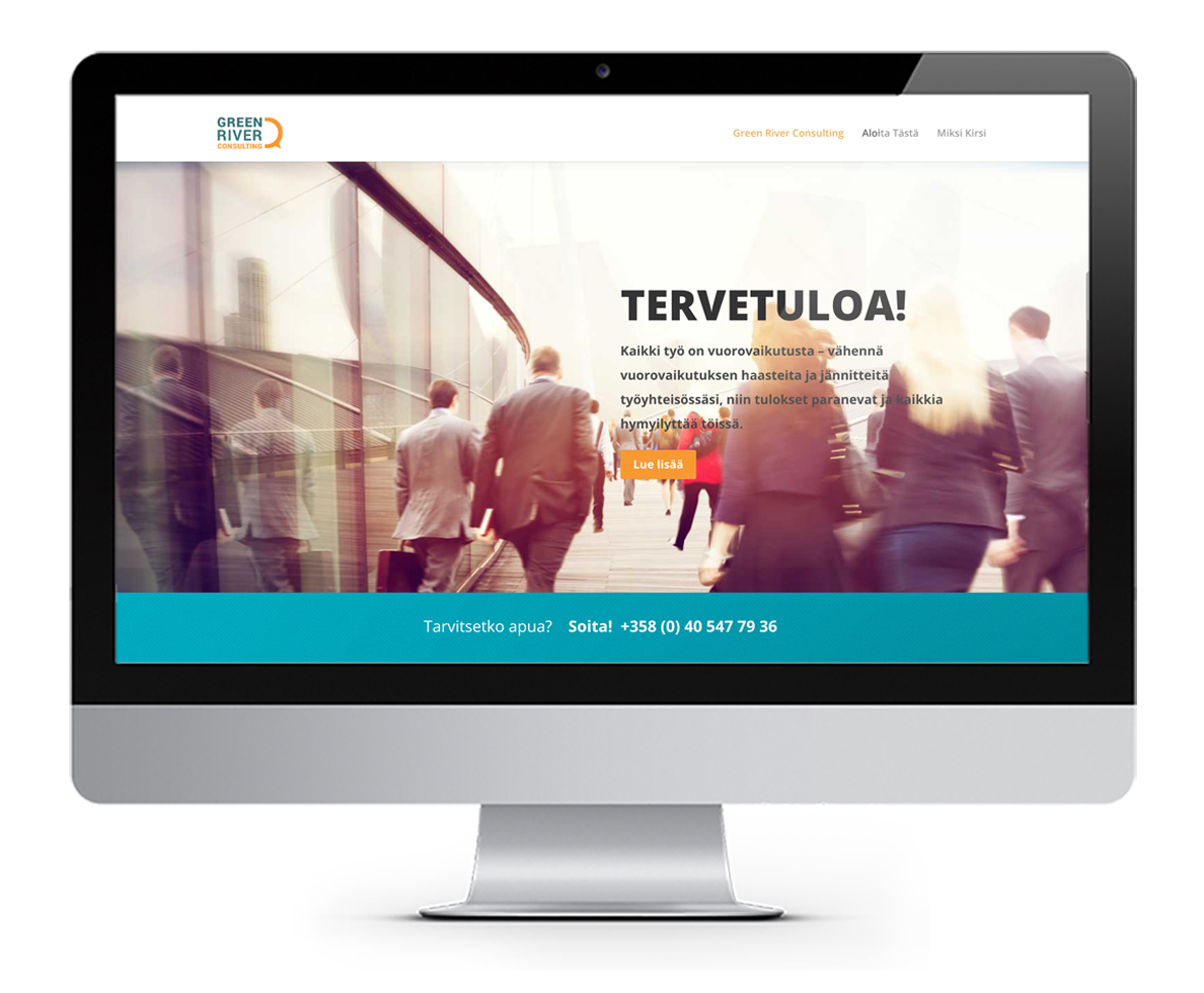
Green River Consulting is a finish consultation company. My role was to create their brand.
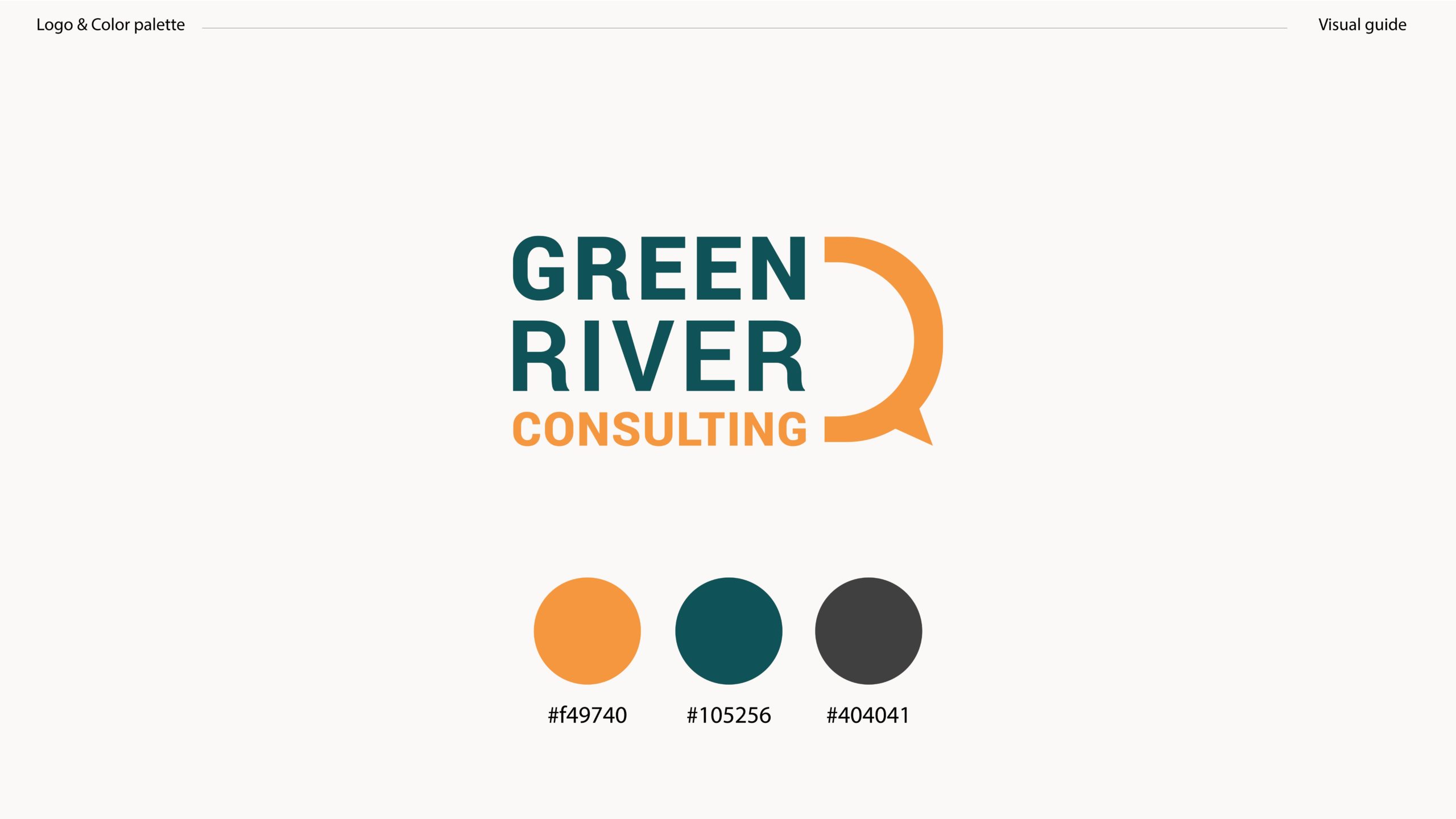
For the logo, I used a warm and cold color to keep the balance in the logo. A balance that appears in a normal life like night and day, positive and negative. This can show that two different view points can complete each other and lead to a better result.
The half bubble in the logo is a symbol for conversation and discussion. It’s not a full circle because only with another viewpoint (consulting), it will be complete.
The blue-green color is used to show ambition, trust, and control. The orange color is to show warmth, optimism, new ideas, and motivation.
Role: Art director, Graphic designer, Web designer
Adjectives/keywords: Simple, professional, experienced, friendly, modern
Date and place: August 2018, Stockholm, Sweden
Program: Adobe Illustrator, Adobe Photoshop, WordPress
Branding
Website design
Full credits
Client: Kirsi Heikkinen
Art director, designer: Kania Khalili
Project manager and Copywriter: Said Moshtaghi
